You're here to eat. Come hungry and bring attitude.

Brüder knew it was time for change. Time for a rebrand, combining the rebellious spirit of the street culture with real Argentinian grilling skills.

Rebrand for a street steak house restaurant in Gran Canaria

Brüder

Links

With the upcoming fifth anniversary, Brüder1906 was ready to stand on its own, and so, the Brüder brand was born. The rebrand covered everything, from the visual identity to menus, social templates and the website. We built a complete brand system that feels bold, and stays true to the street spirit that is Brüder. The result? A brand that speaks with attitude, increasing returning customers and bumping revenue with 20%. 

Born in 2020 under the name Brüder1906, this Street Steak House restaurant was among the first to open their doors just after the pandemic hit. The idea came from two Argentinian brothers, Sebastián and Gastón, who built their concept around fire and craftsmanship. Their “grill first” philosophy spoke for itself.

Brüder1906 became known in the area over the years for its high quality meat, juicy burgers, and friendly atmosphere where friends could come together over great food and drinks. By 2025, Brüder1906 was ready to evolve their brand and identity. The “1906”, by Estrella Galicia, was ready to go, leaving Brüder free to stand on its own.

With their 5th anniversary coming up, Brüder saw this date as a chance to move forward. It was time for a rebrand. The decision to drop the “1906” wasn’t just a name change, it was a declaration of independence. They wanted to continue on their own, to get back in touch with old customers and to spark interest in a whole new group of fans.

The goal was clear: turn the brand into a true Street Steak House that lived and breathed Brüder’s core values. Be rebellious and humorous, but friendly, with authentic Argentinian know-how without having to say it out loud. Brüder needed a rebrand that would match their work and help them move towards the next chapter.

The rebrand started in the most Brüder way possible: a quick chat on the curb outside of the restaurant while it was being renovated. No boardrooms, no bs. All we needed was a clear vision, and everyone on the same page. The brief was short but strong: get rid of the “1906” skin and make a brand that would fit the new decor, menu and vibe. Make it Brüder.

We jumped straight into design, using their “Steet Steak House” with their Argentinian know-how as a guide. We created a visual identity based on confidence and grit, and we paired it with a rebellious brand messaging, voice and tone, to fit their authentic street spirit.

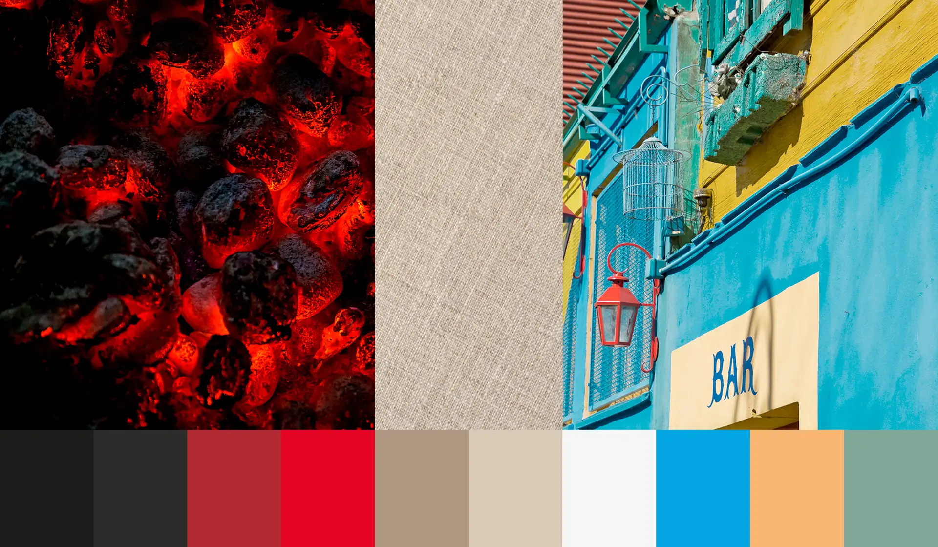
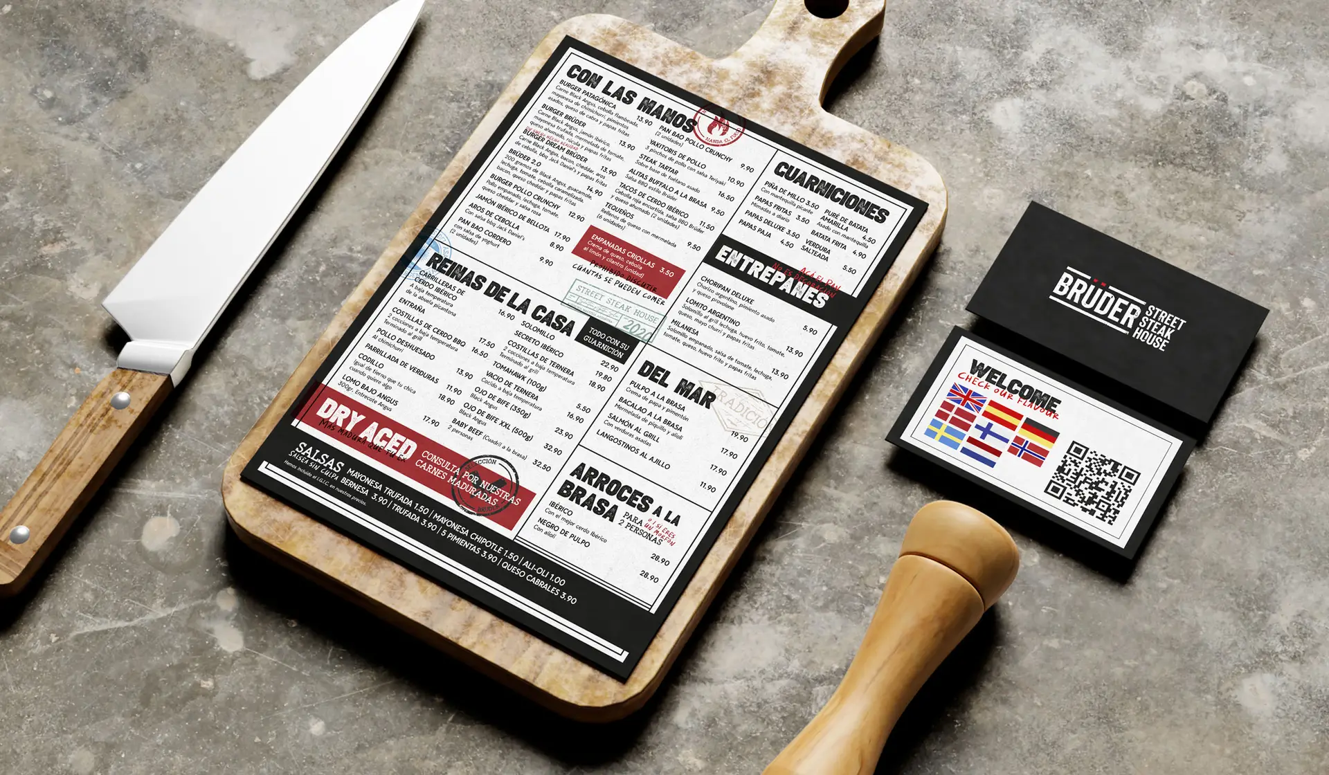
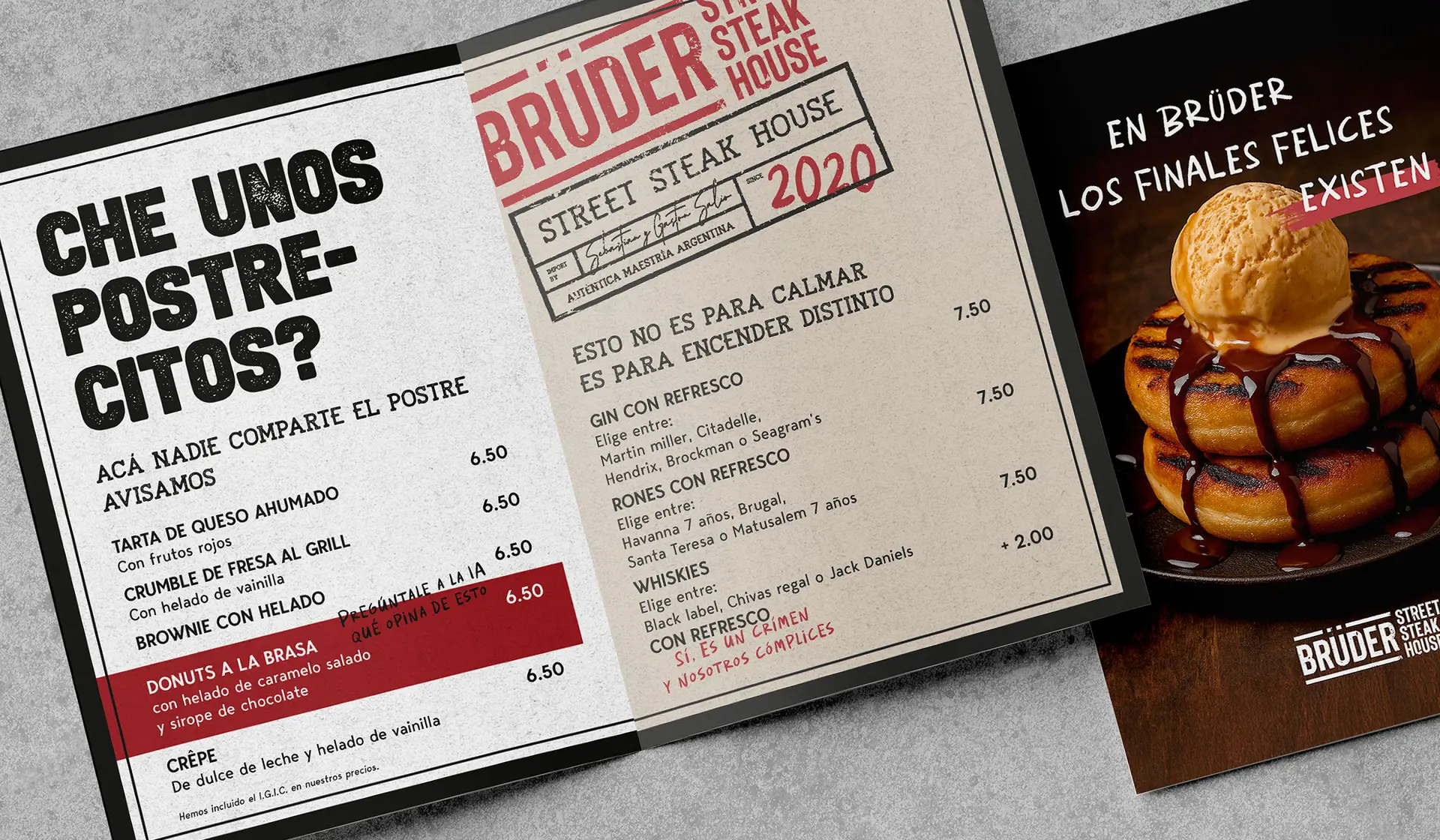
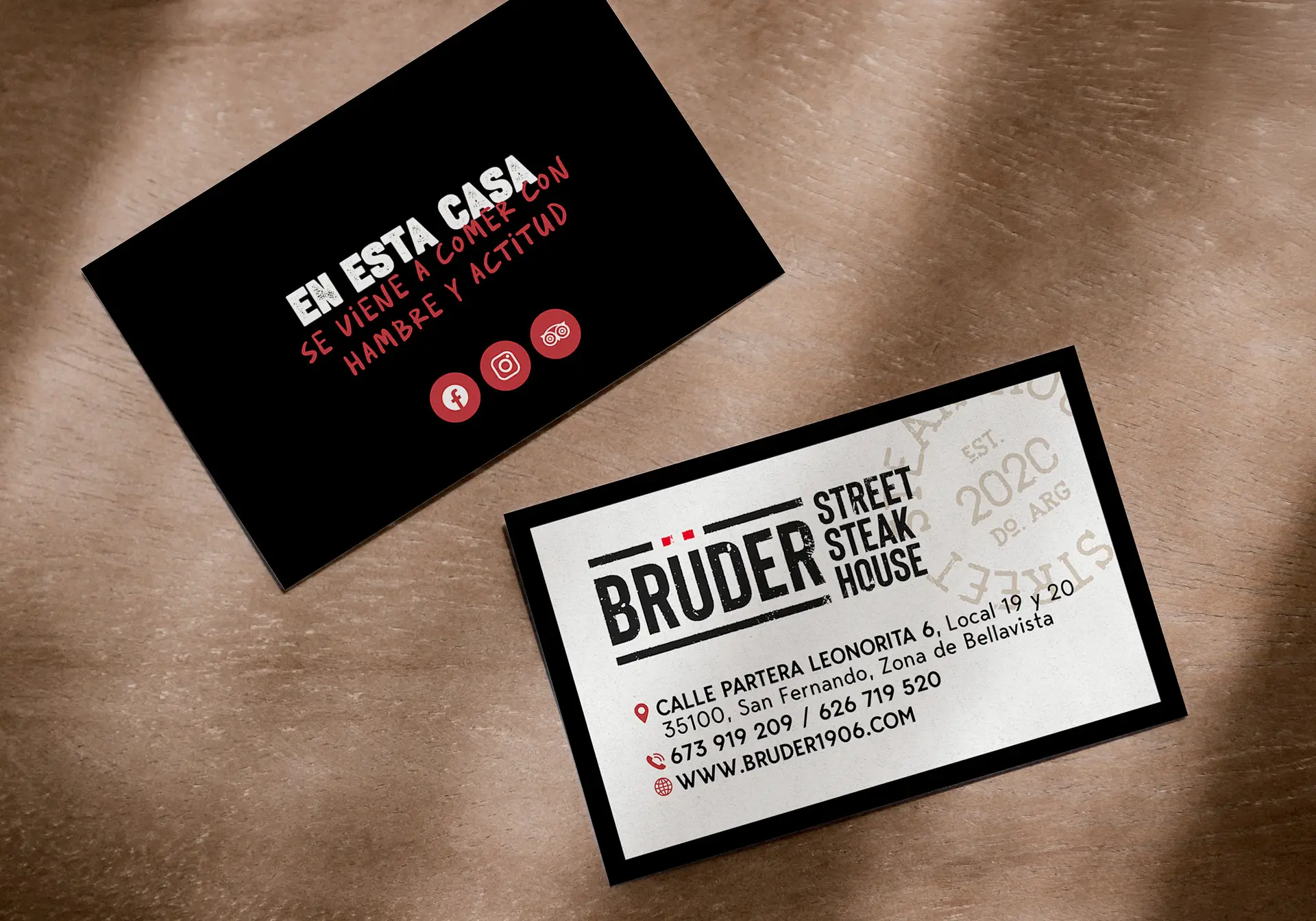
We changed every part of Brüder’s customer experience, beginning with the logo. Confident, bold and instantly recognisable. The colors changed a little from what they used to be, leaving behind the 1906 palette. We used charcoal-black and fire-red for strength, and a warm beige to soften it. The typography system includes clean, easy to read fonts for the restaurant menus and other functional items and rough, gritty fonts for headlines and statements that needed to be loud.

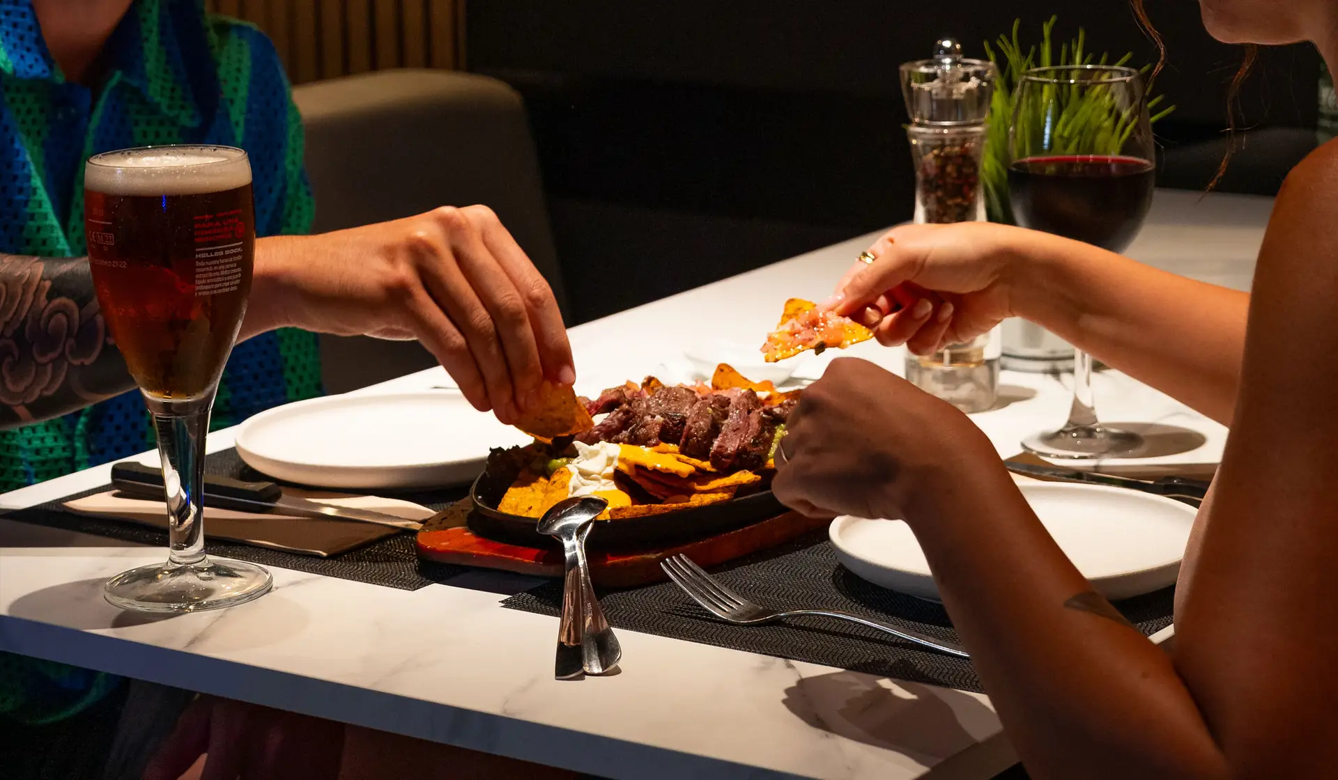
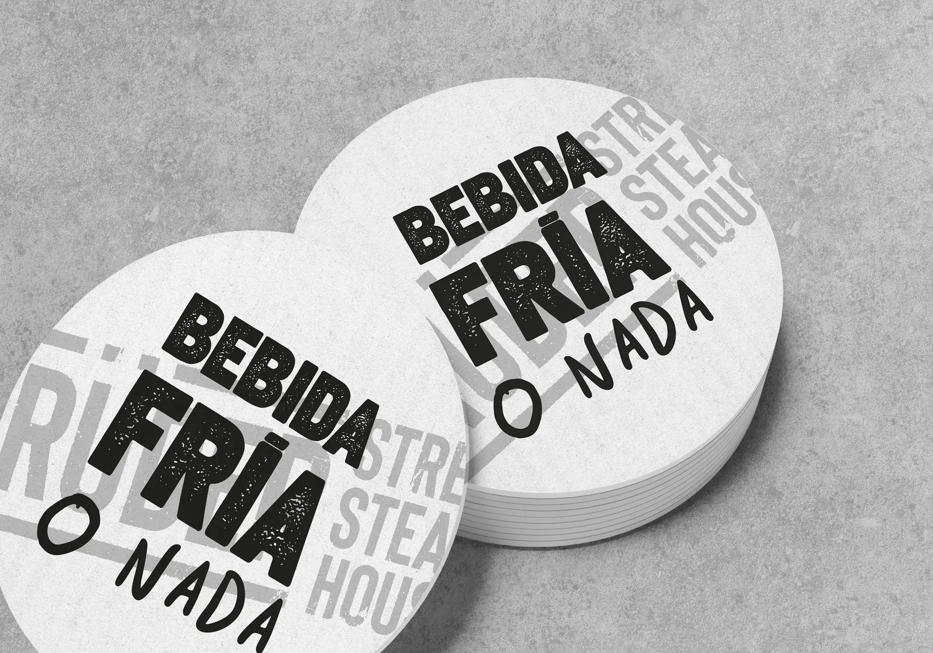
We made a set of custom stamps that looked weathered, carrying short brand messages. Some even had the names of Sebastián and Gastón to make the brand feel personal and human. The menus got a complete overhaul, with a simplified layout and bolder messaging. The format changed to match their updated street style. Drink coasters, signage, uniforms and the disposable placemats all got the same bold, new look.

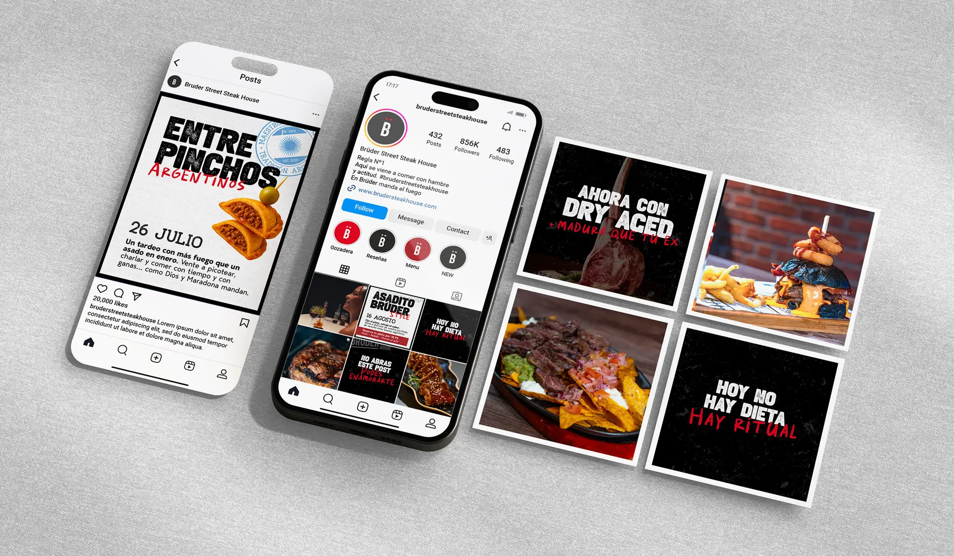
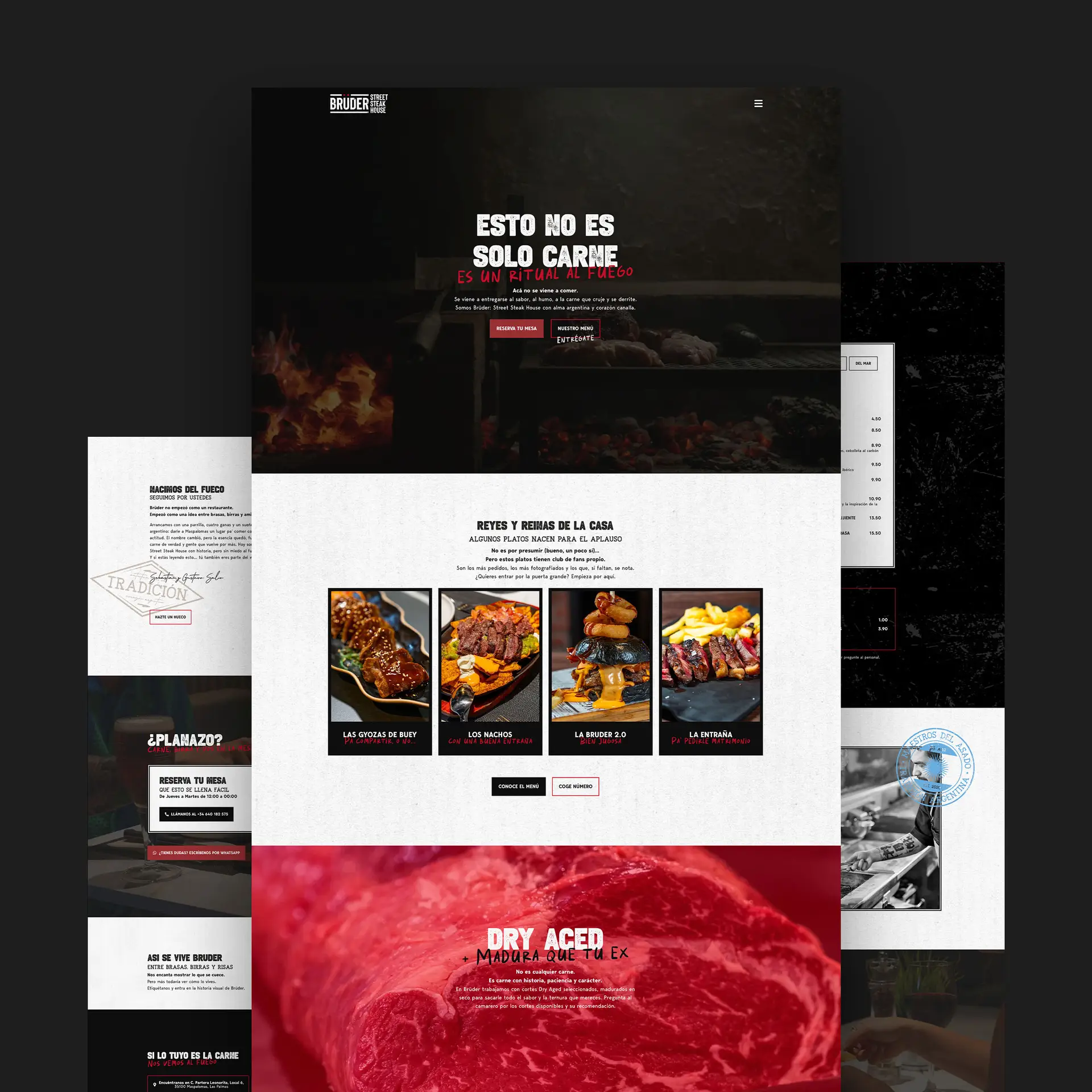
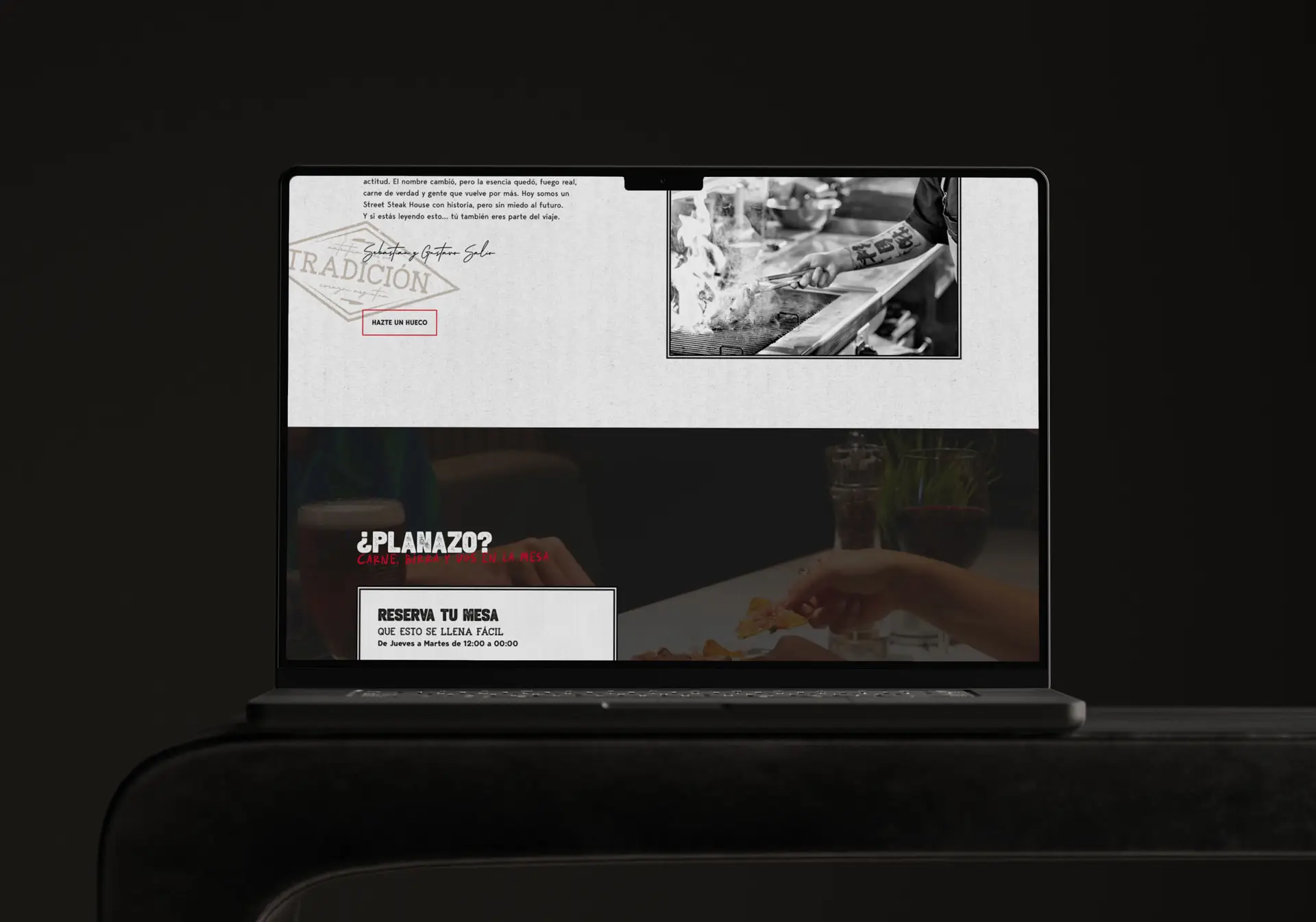
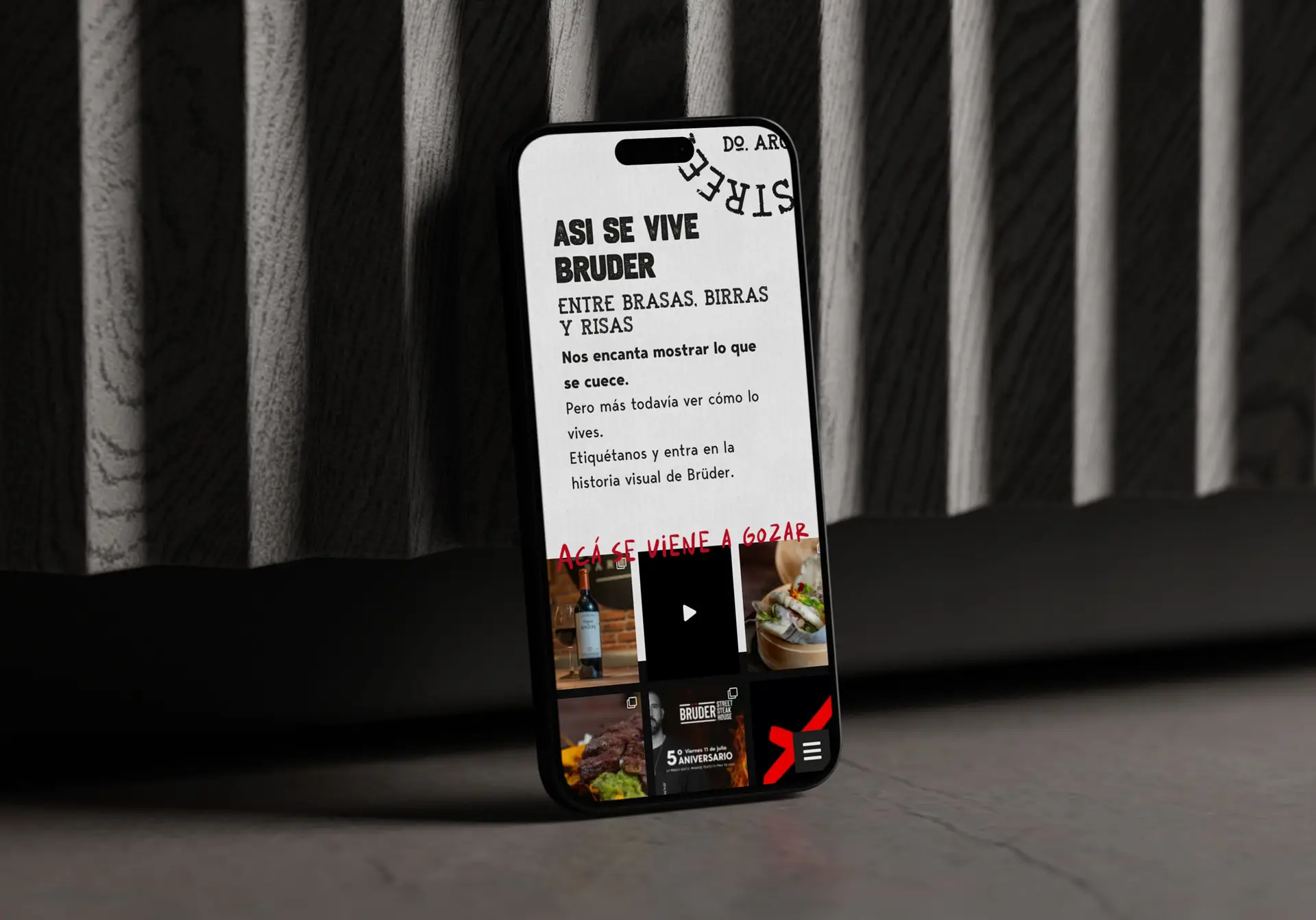
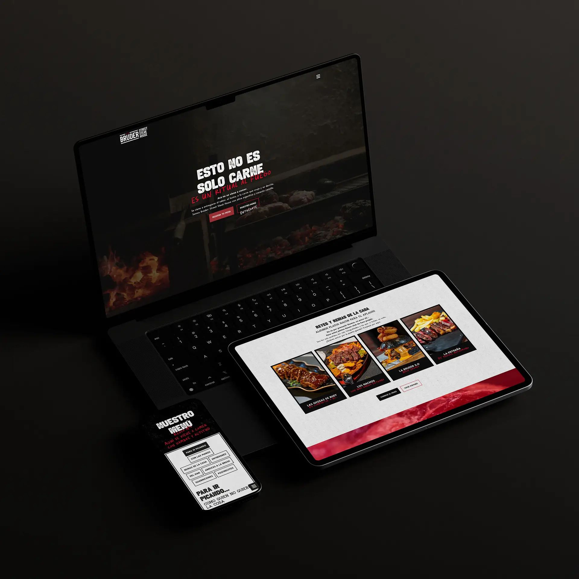
The website made the whole experience available online, so customers could easily look at the menu, make reservations or get a feel for Brüder’s atmosphere before they got there. We also made branded templates for Brüder’s team to use on social media so they could post photos, promotions, and updates without losing the look of the brand.

The rollout of the rebrand happened during the restaurant’s renovation and by the time of their anniversary, every touchpoint had been worked on, making the brand feel complete, new, yet familiar.

Within months after the rebrand, Brüder’s sales went up by 20%, increasing repeating customers. Old regulars came back, sparked by the rebrand and new food offer, and new customers came in out of curiosity. The real win was the alignment. The brand now perfectly represents who Brüder is and what theiy believe in. A casual chat outside the restaurant turned into a big moment in their story, paving the way for new growth and recognition.

Brüder street steak house restaurant rebrand logo design

Let's get in touch!