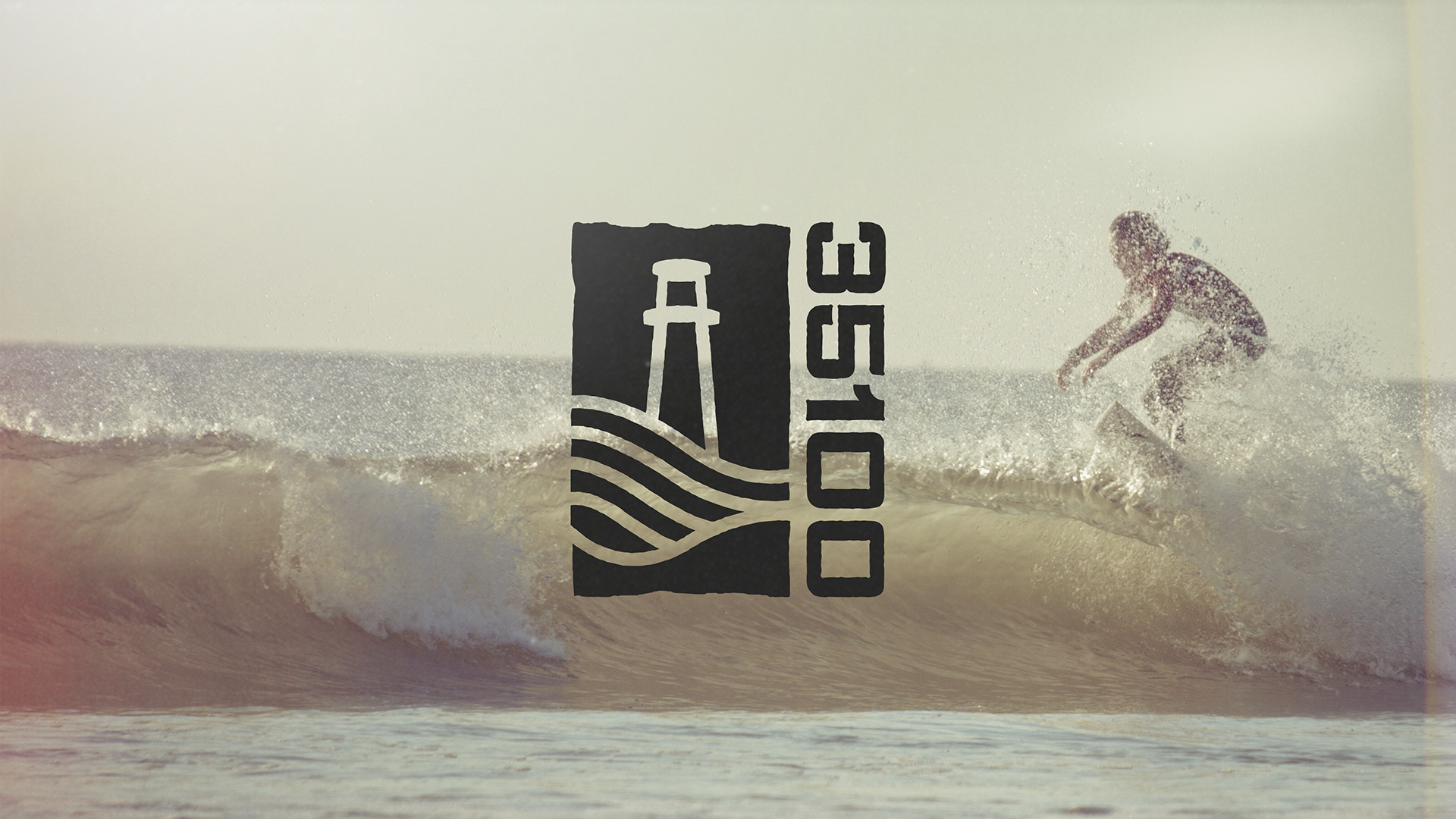
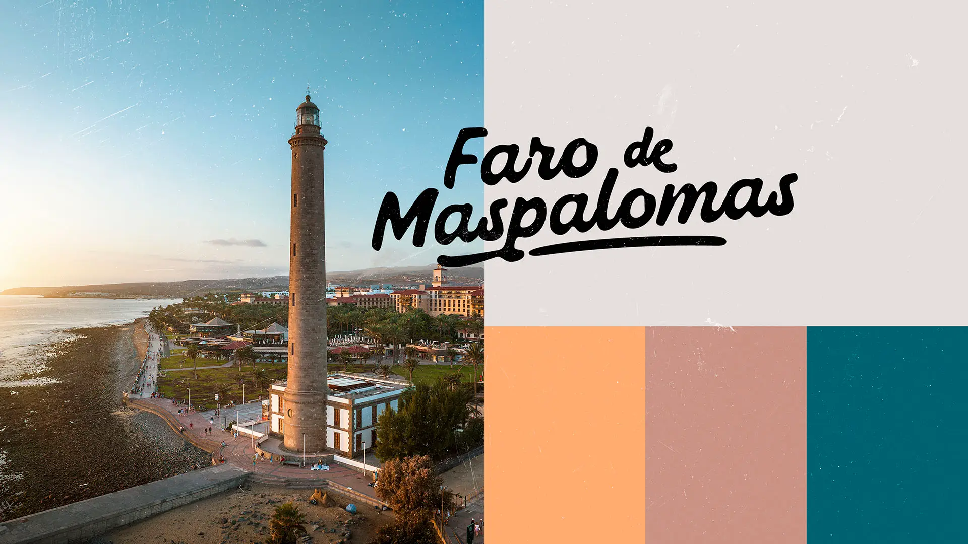
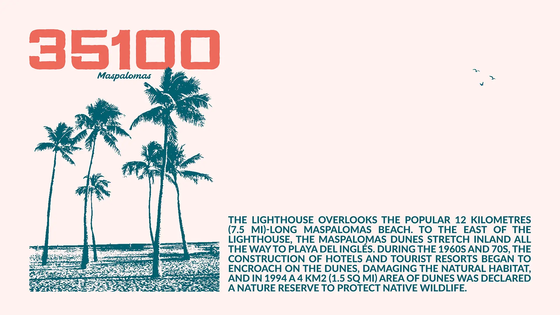
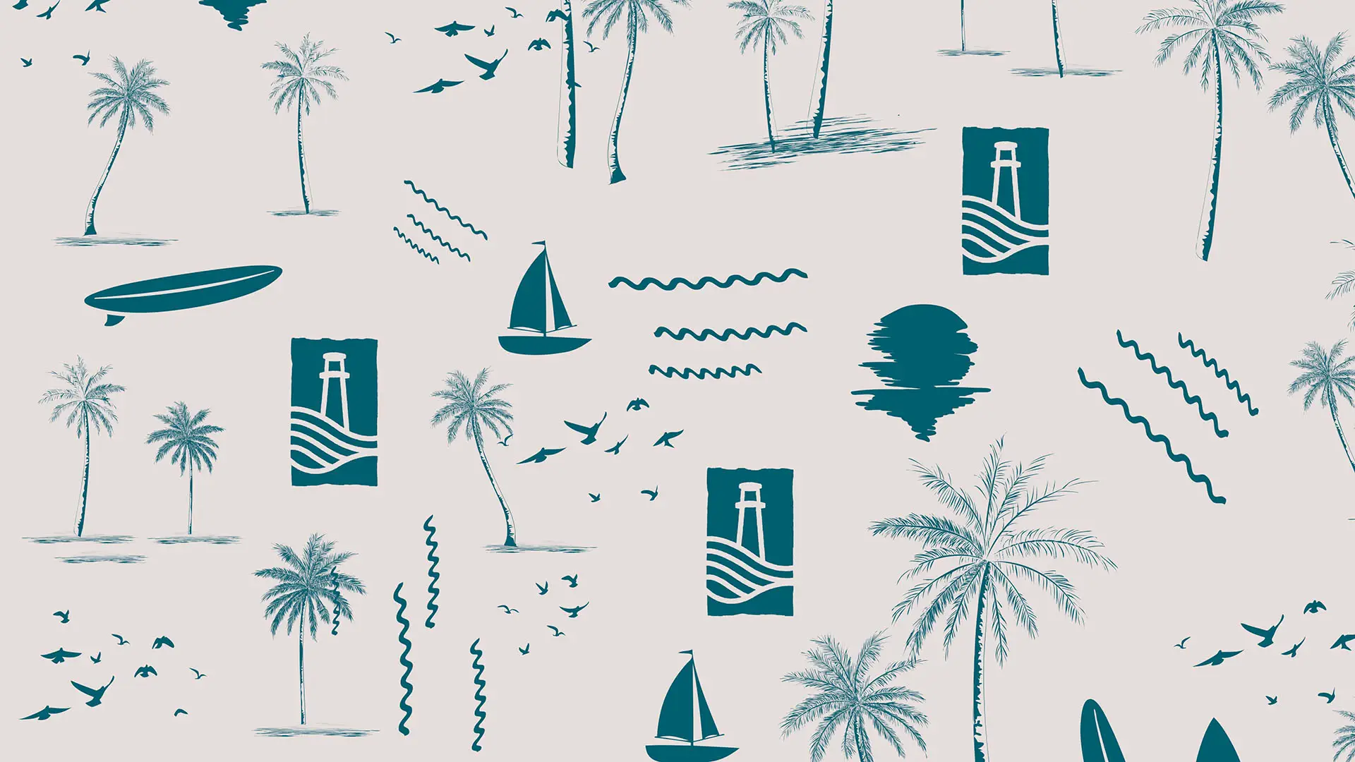
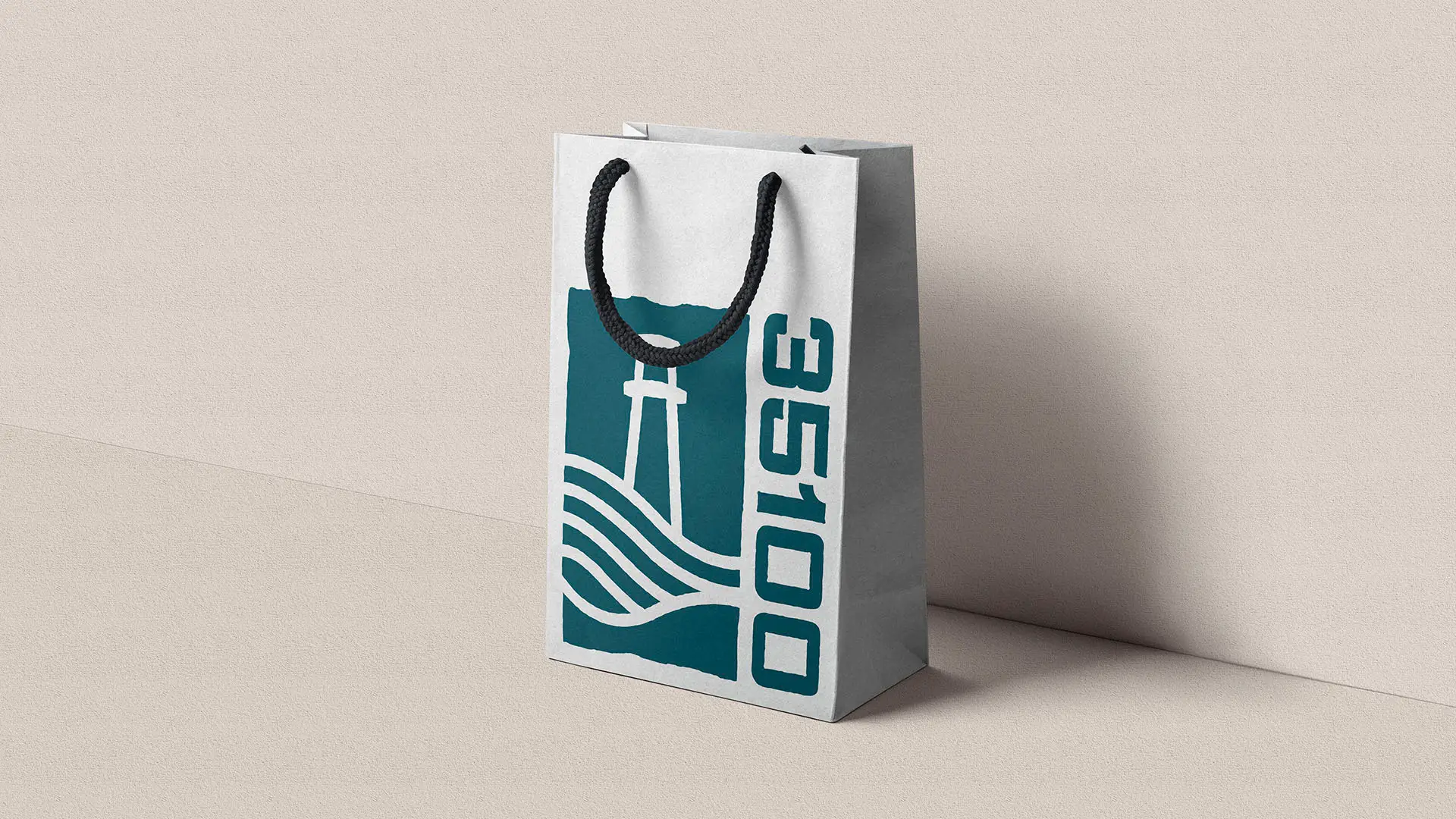
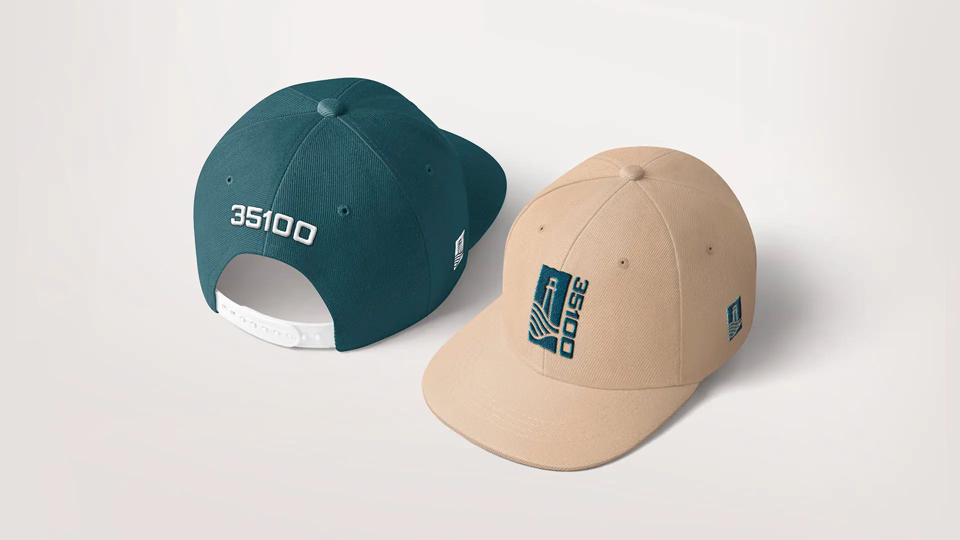
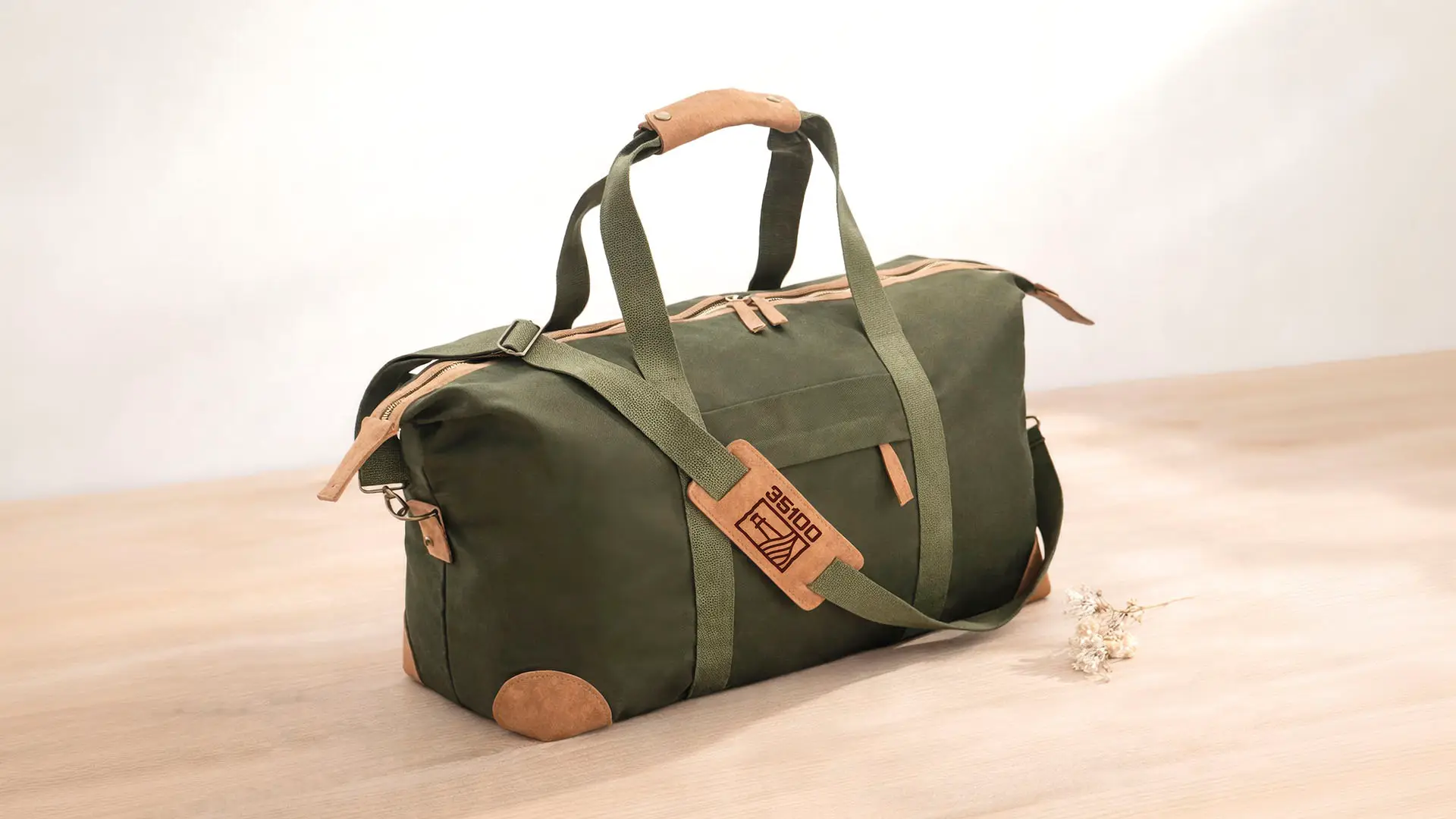
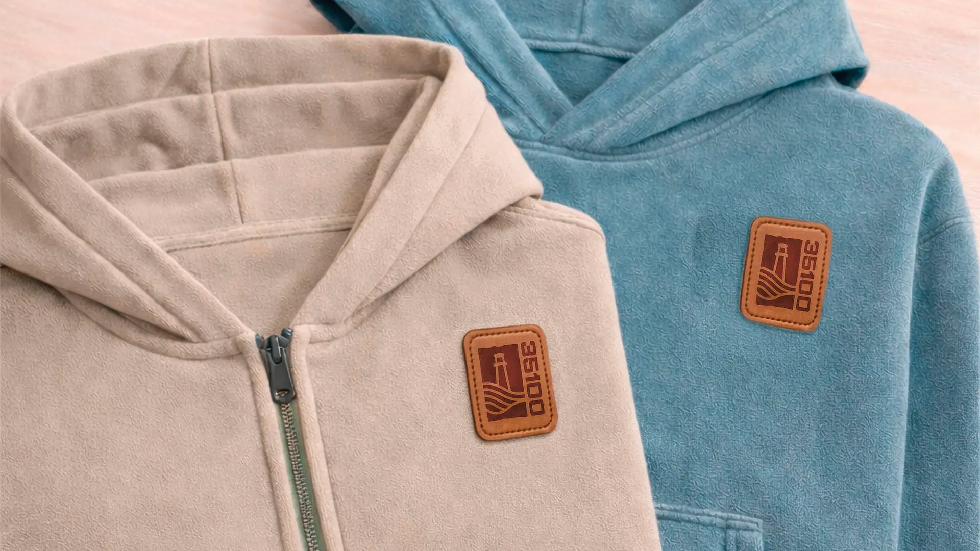
One of the early ideas was to shape the 35100 numerals into a lighthouse silhouette. The Maspalomas lighthouse is one of the most iconic landmarks on the island, so it felt only natural to explore the idea. It worked as a concept but not as a mark.. so we moved on. The lighthouse became its own element, built properly, including the waves of the Atlantic and the lines of the Maspalomas dunes. Tribute to the landscape that surrounds it every day.
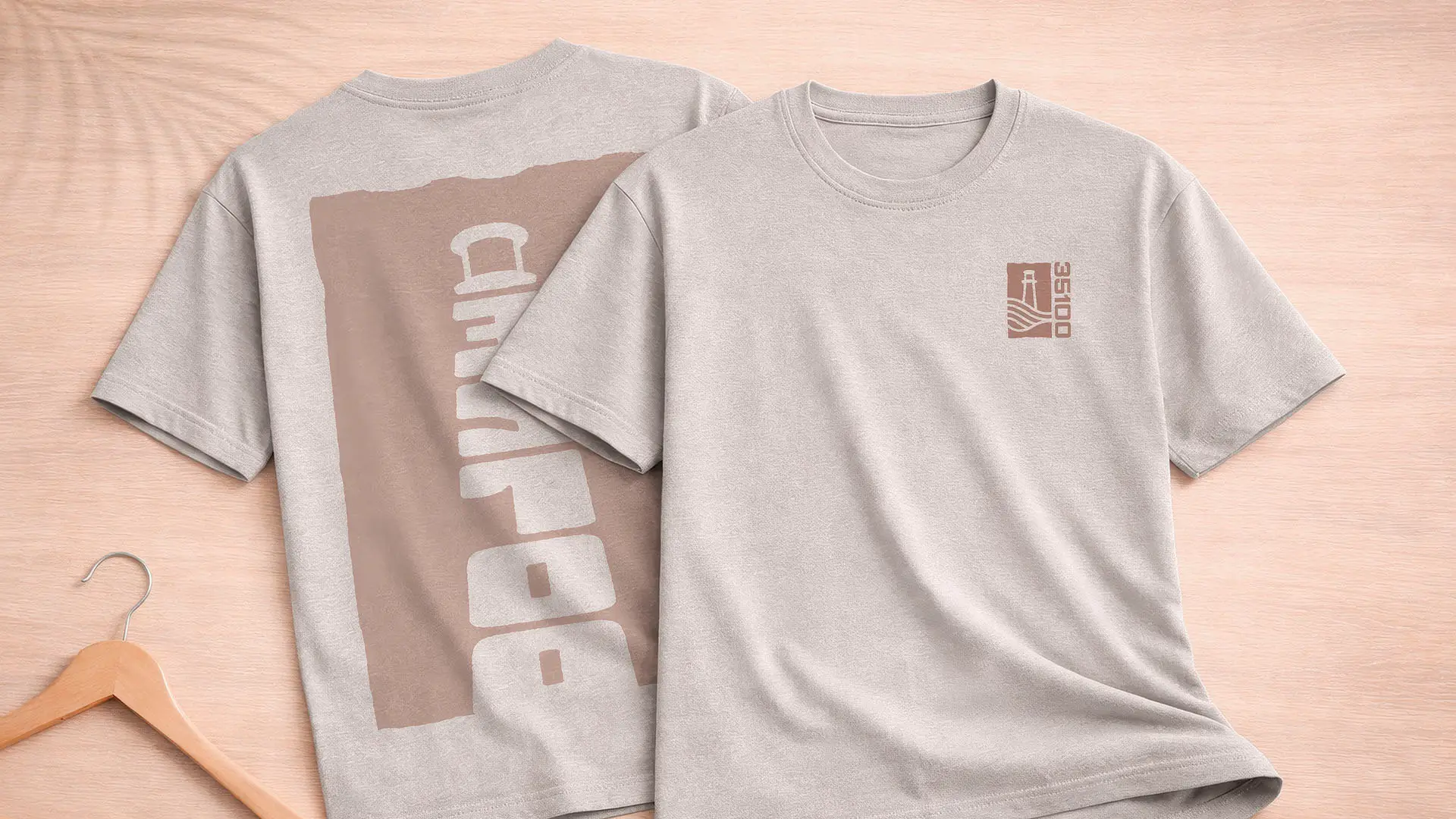
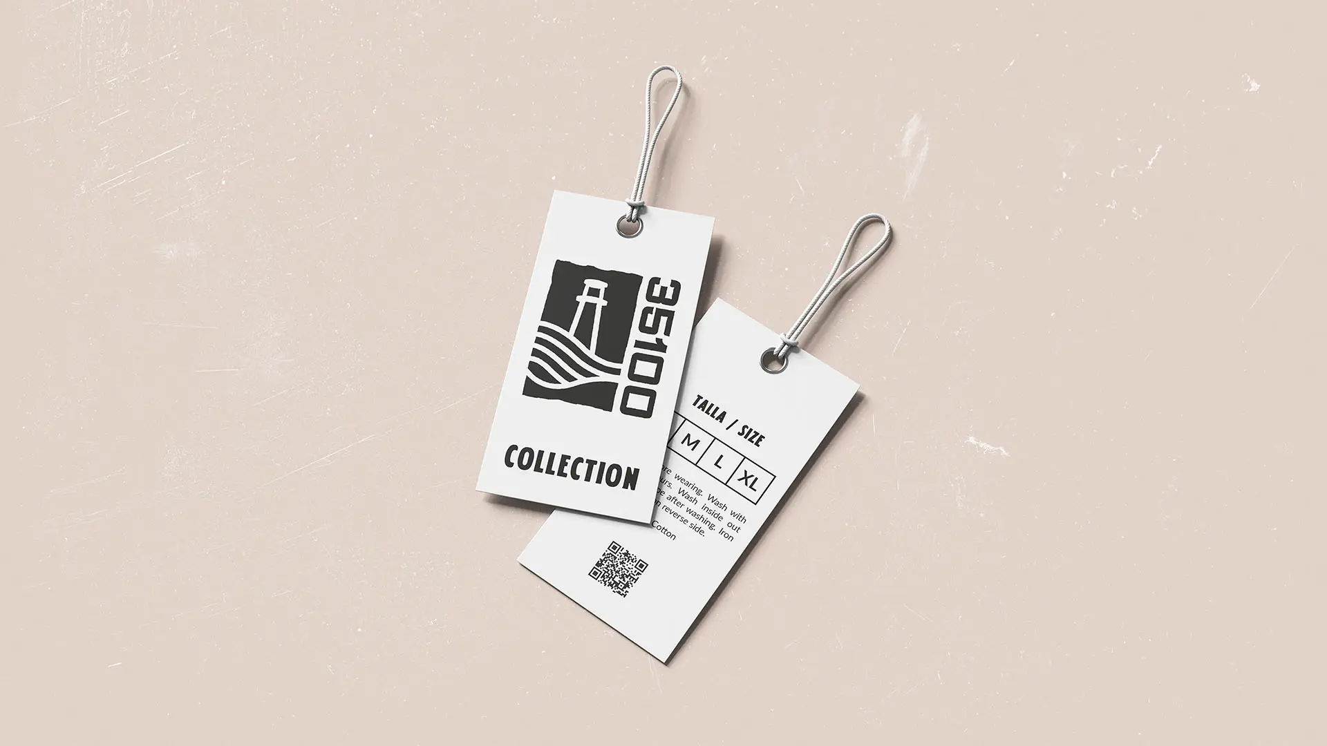
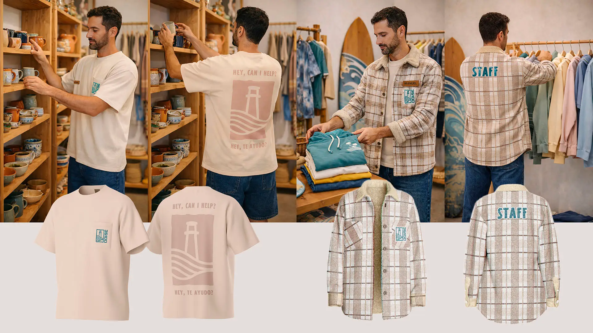
The format the mark lives in was shaped by the scalability requirement. It needed to work embroidered on a chest pocket, embossed on a leather tag, and printed large across a paper bag. A contained, stamp-style block answered all of those at once. Strong contrast, clean edges, nothing that disappears when scaling down.
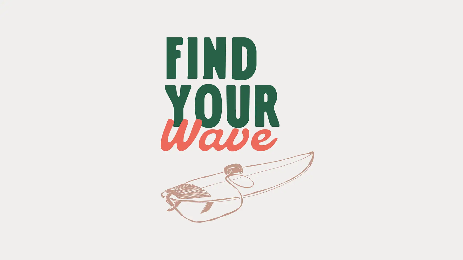
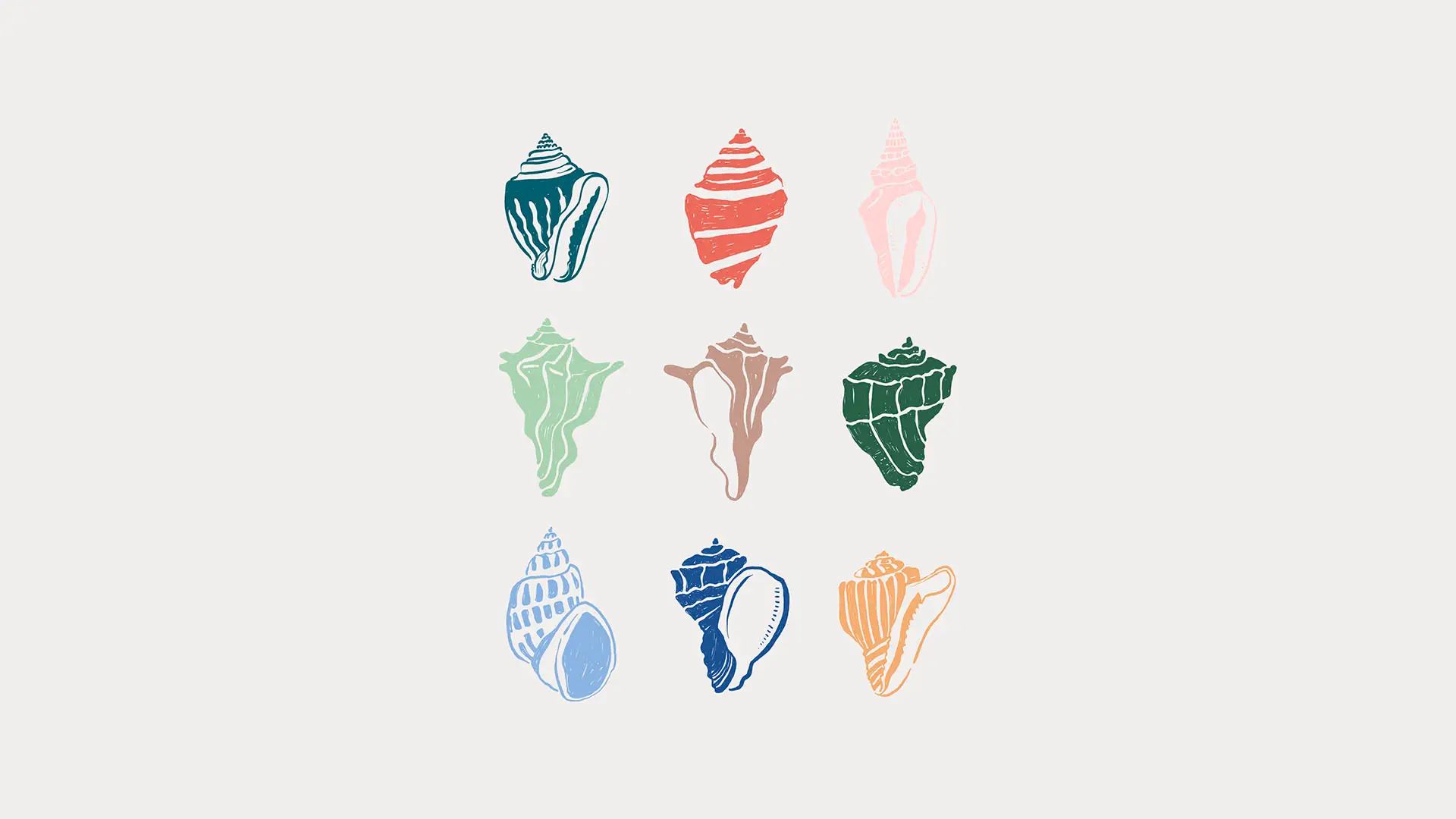
Color came from the same place as the mark. The teal from the Atlantic, the warm sand and cream from the dunes, and the terracotta and blush from the light the island holds in the late afternoon. From there, we built out the broader visual system: an illustration library of seashells, palms, sailboats and wave lines that could work independently or tile into patterns for wrapping paper and printed fabrics.
The full delivery included the logo system and its variants, color palette and typography, packaging across bags, tags, stickers and wrapping paper, social media templates, business card, shop signage, staff uniforms, and the custom illustration set.